Documentation Index
Fetch the complete documentation index at: https://docs.gp.scale.com/llms.txt
Use this file to discover all available pages before exploring further.
Using Sample Data: The examples on this page use fields from our sample dataset. Download it and create an evaluation with it to follow along with this tutorial.
When to Use
Use histogram widgets to:- Show value distributions (groups data by distinct values)
- Visualize frequency counts or aggregated metrics
- Identify patterns in numerical data
- Display aggregated data in a distribution format
Configuration
Required Fields
Widget display name shown on the dashboard
Must be set to “histogram”
SeriesQuery selecting the column
X-Axis Configuration (One Required)
You must provide eitherx_column or x_column_group, but not both:
Single column name to group by for the x-axis. The histogram displays distinct values from this column.Example:
"overall_score" - groups by each score value (75, 80, 85, etc.)Array of column names for multi-dimensional grouping. Creates separate distributions for each combination.Example:
["agent_name"] - creates separate distributions for each agentNote: Multi-dimensional grouping creates overlaid or stacked distributions for comparison.Optional Config Fields
Controls whether multiple distributions are stacked or overlaid.
true(default): Stack distributions on top of each otherfalse: Overlay distributions for easier comparison
Query Requirements
Histogram widgets require a SeriesQuery with:- Select the column you want to group by (becomes the x-axis)
- Can include aggregations (
COUNT,SUM,AVG, etc.) for the y-axis - If no aggregation is specified,
COUNTis used by default - Can include
filterto narrow the dataset
Creating in the UI
Add Aggregations (Optional)
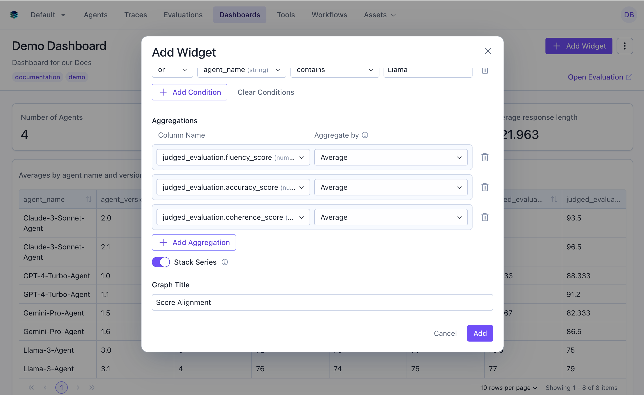
COUNT is used by default.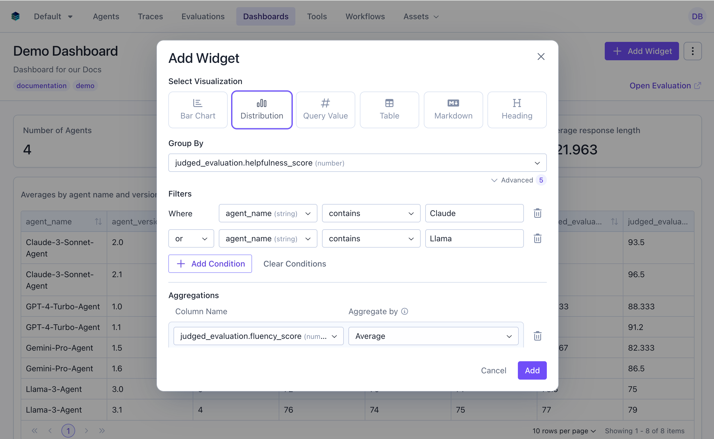
Output Format
Histogram widgets return grouped data:Example Use Cases
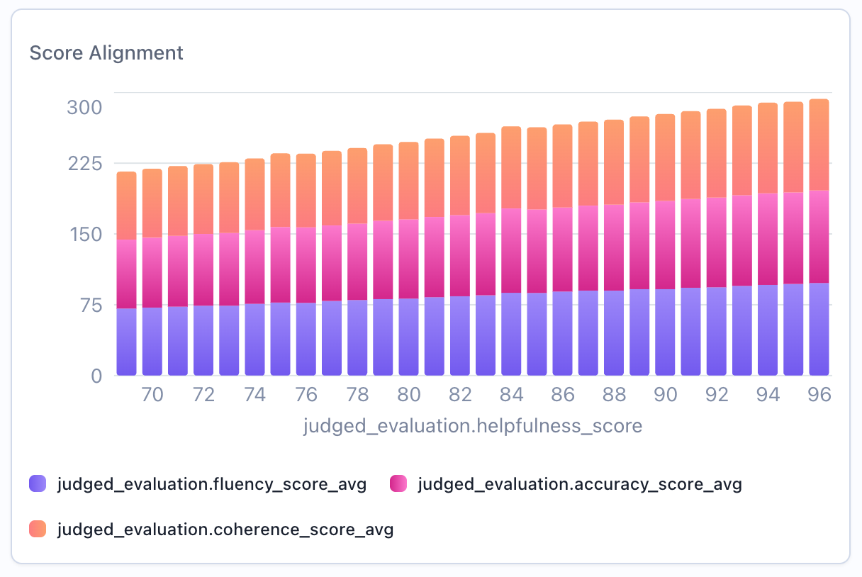
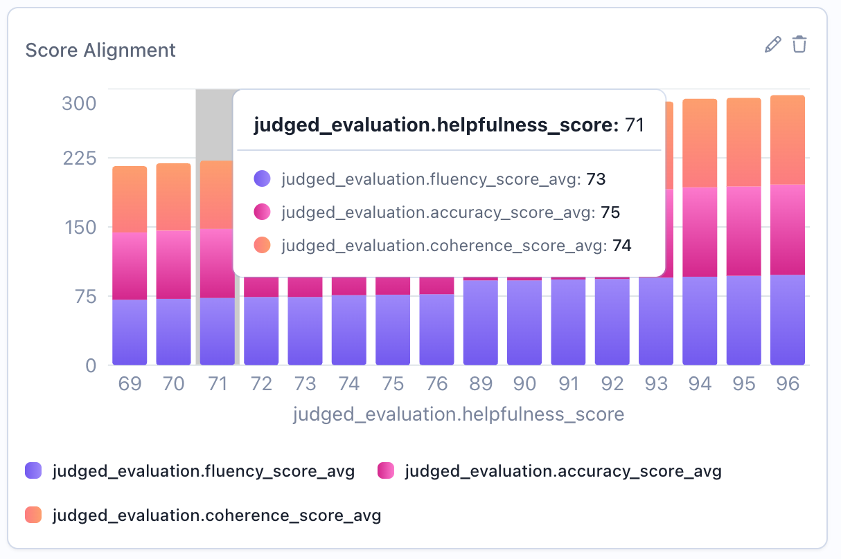
Use Case 1: Overall Score Distribution
Visualize how overall scores are distributed across all evaluations. This will by default show the count of evaluations for each score value.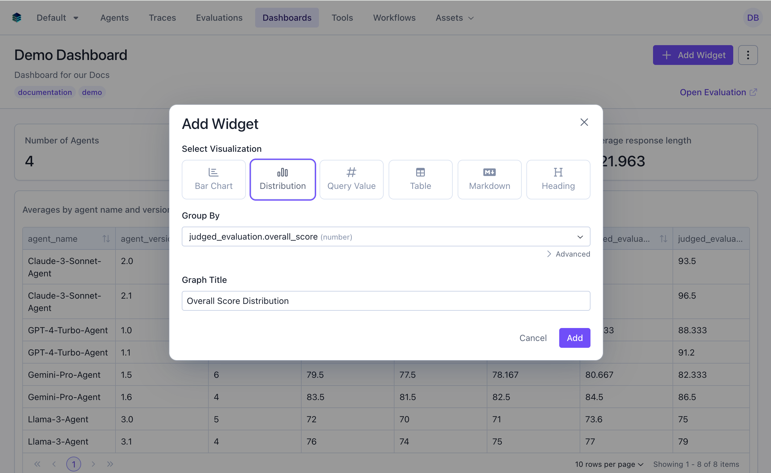
Use Case 2: Technical Task Score Distribution
Show distribution for evaluations in the technical category only.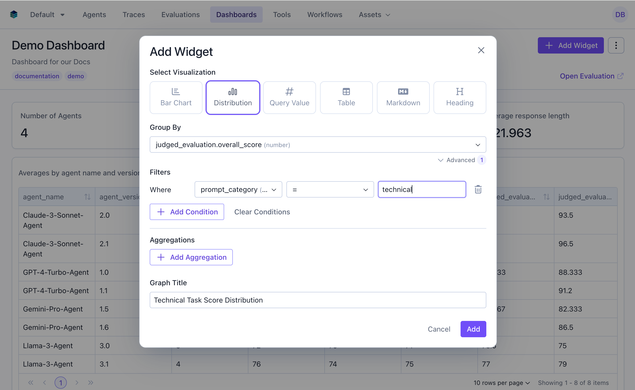
Use Case 3: Comparing Distributions Across Categories
Create overlaid histograms to compare score distributions across different scores.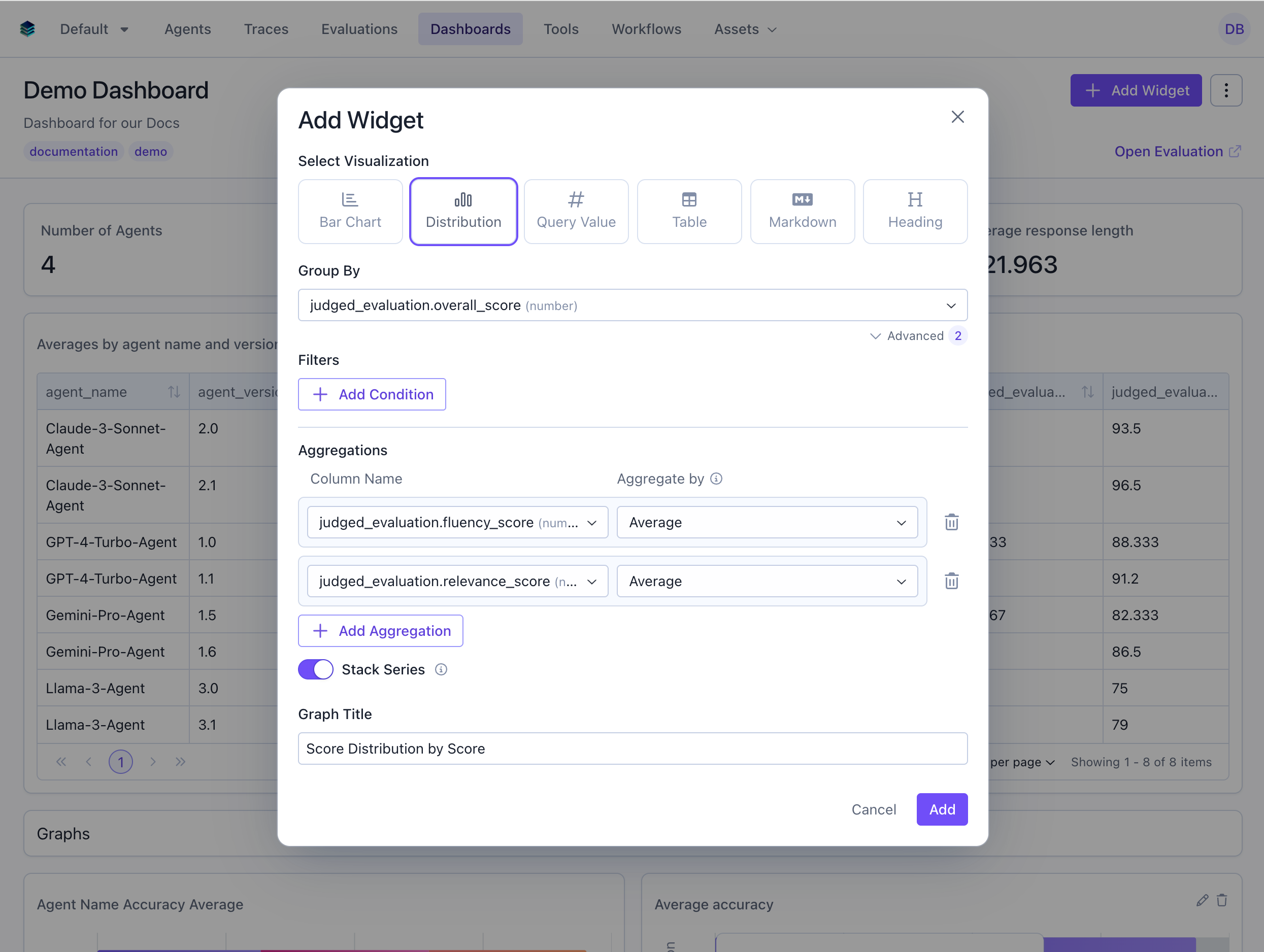
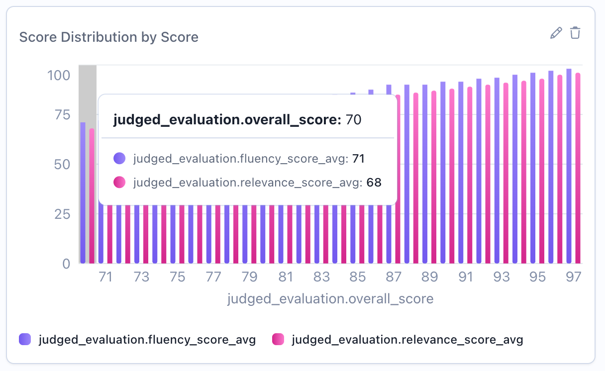
Stacked vs Overlaid Distributions
When comparing distributions across groups, you can control visualization style:Overlaid Distributions (Unstacked)
- Comparing distribution shapes directly
- Identifying differences in peaks and spread
- Seeing all distributions simultaneously
Stacked Distributions
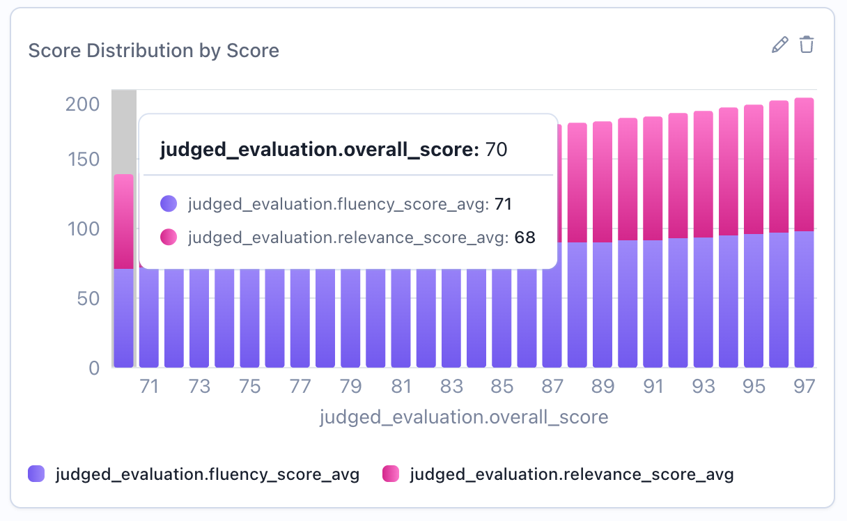
- Showing total counts across all groups
- Part-to-whole relationships
- When cumulative view is meaningful
Related Documentation
- Bar Chart Widget - For categorical distributions
- Metric Widget - Show percentiles and statistical measures
- Table Widget - Detailed numerical breakdowns
- Query Language - Filter and column syntax